Food & Cooking
Sweet/Salty
A recipe site built for the cook, not the search engine.
Overview & Context
Recipe sites are one of the most visited categories on the web — and also one of the most frustrating to use. Most of them are buried under ads, auto-play videos, and endless backstory padding designed to satisfy SEO crawlers, not the person standing at the counter with flour on their hands.
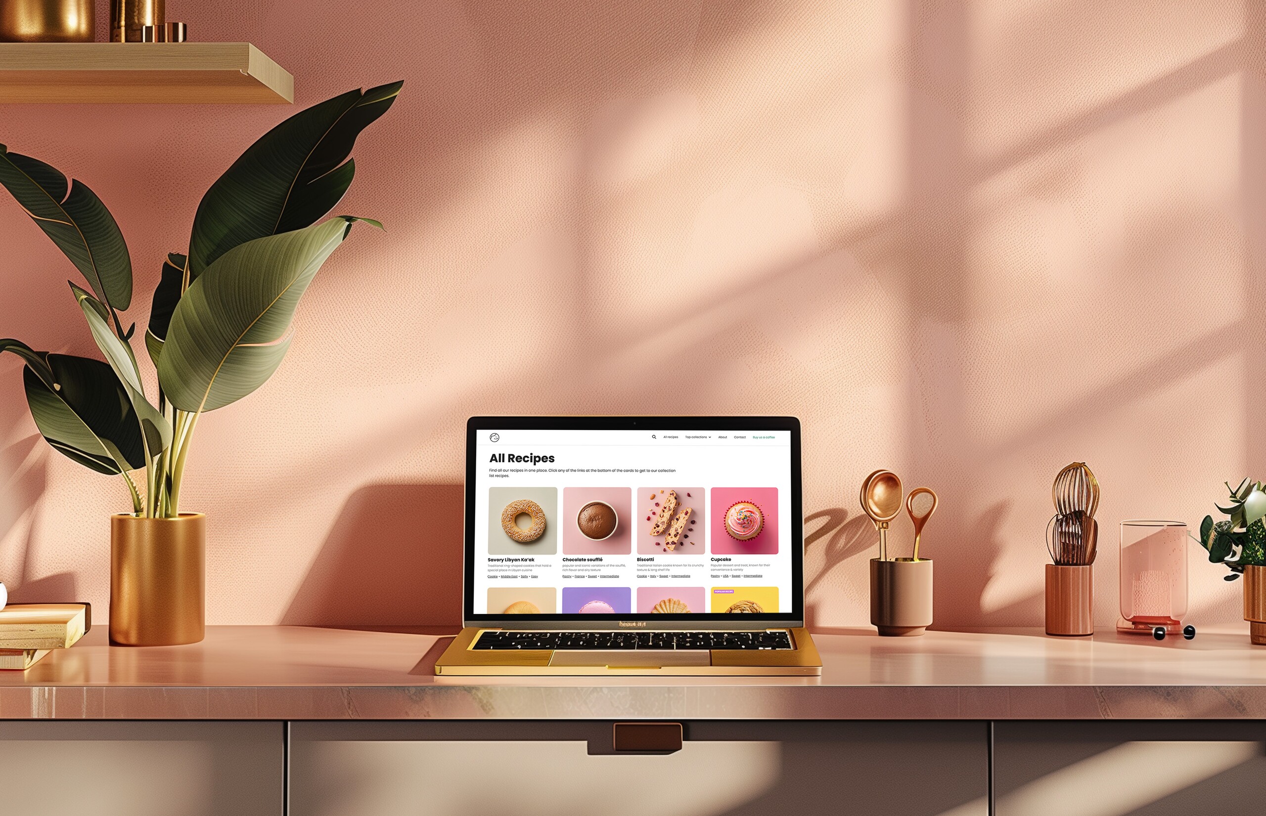
Sweet/Salty started as a Webflow project. I later redesigned it in Figma and rebuilt it with AI assistance into a live site running off GitHub — which also became a practical exercise in how much faster the whole process gets when AI is part of the workflow.
My Role & Constraints
Sole designer and developer — concept, visual design, and front-end build. Recipes and images are generated with AI as a starting point; I cook, write, and adjust each one before it goes live. No team, no external deadline. The main constraint was time: it had to be simple enough to maintain alone, but polished enough to feel like a finished product.
The Problem
The problem wasn’t aesthetics — it was information architecture. Recipe sites are optimised for Google, not for the cook. They bury the recipe, load slowly on mobile, and are nearly impossible to scan mid-cook when your hands are covered in dough.
The real question was: what does a recipe site look like when it treats the user — not the search engine — as the primary audience?
Key Decisions
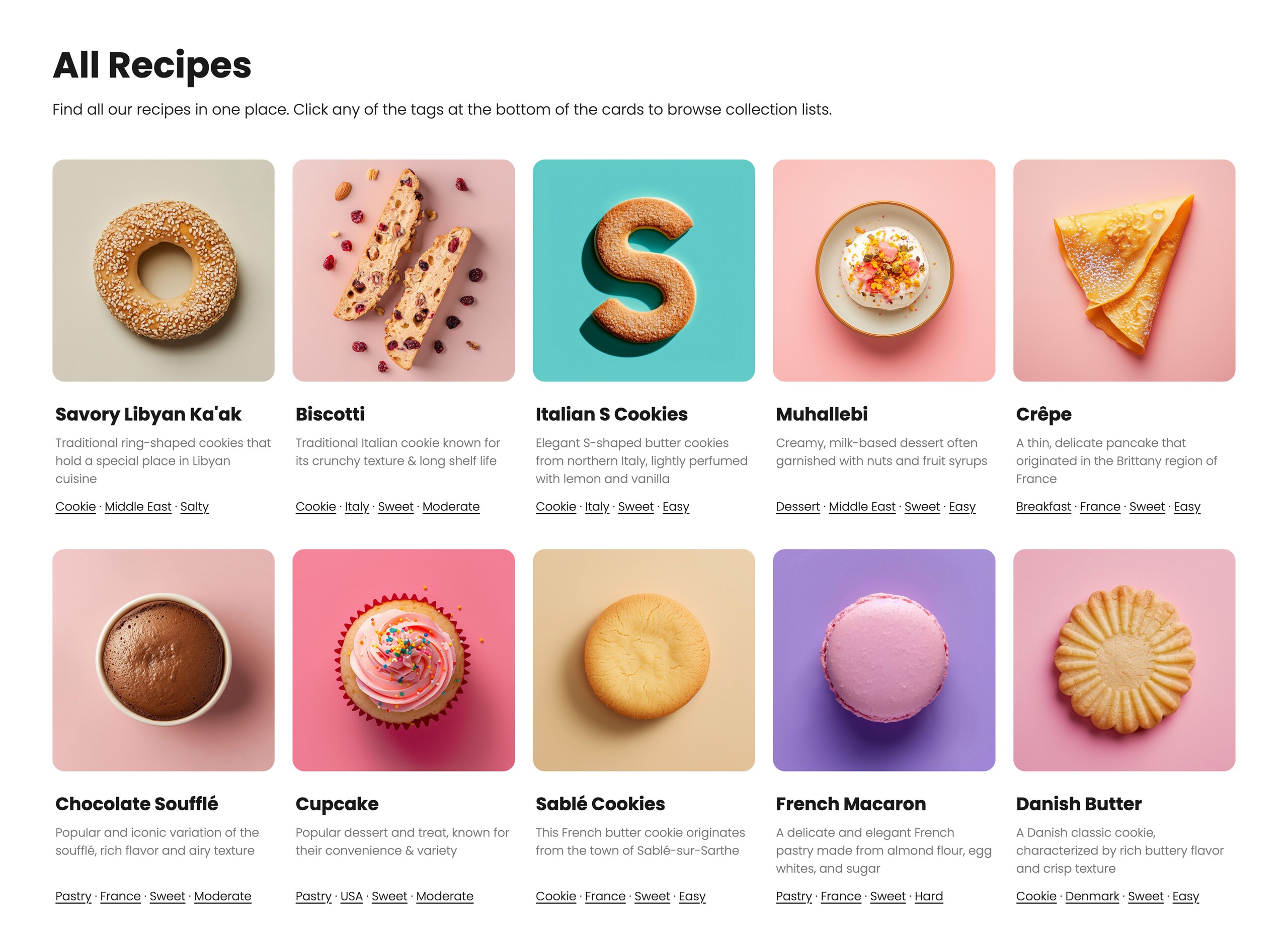
Structure drawn from e-commerce. Having spent years on digital commerce products, my instinct was to bring that thinking here: clear categories, sorting, and browsable recipe groups so users can find what they want without friction. The same logic that makes a good product catalogue makes a good recipe site.
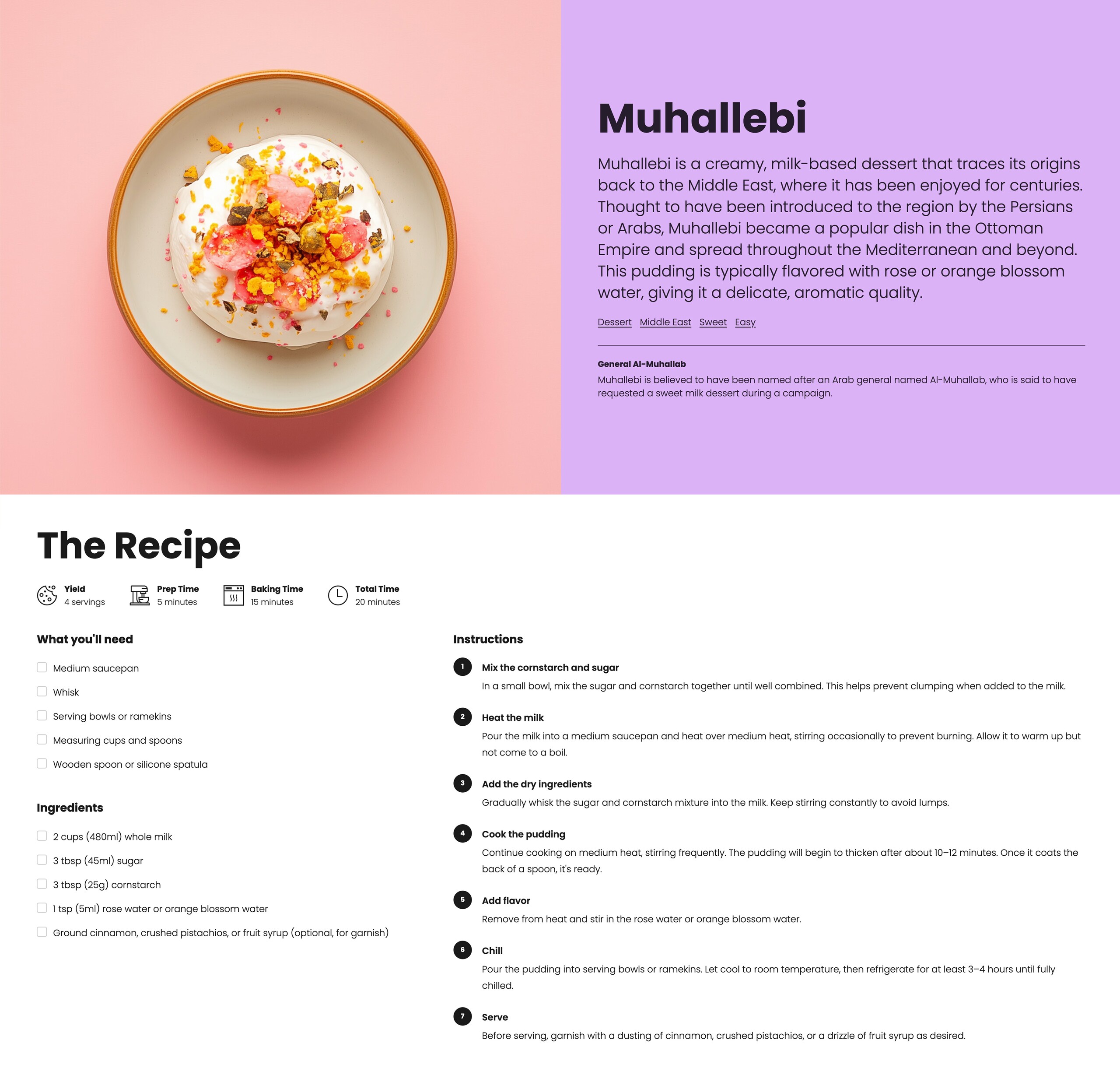
Clean recipe pages. Each page is stripped to the essentials — ingredients and steps. No backstory, no SEO filler. The recipe is the product.
Fun facts as a light touch. Each recipe includes one short fun fact — enough personality to make the site memorable, never enough to get in the way of the recipe itself.
Mobile-first typography. Most people cook from their phone with the screen propped up somewhere. Legibility at a glance, from arm’s length, became the primary typographic constraint — large font sizes, high contrast, generous line spacing.
Outcome
The site is live and growing a small, real audience — readers arrive mostly through the site’s Facebook community, where new recipes get shared and cooked, and traffic has been climbing since the site came back online after the AI rebuild. It remains the personal project I actually use myself — which is the only metric that matters for a side project.
What I’d Do Differently
Starting in Webflow with a CMS was genuinely daunting. There was a lot of back and forth, frequent blockers, and things I simply couldn’t get done the way I wanted. In 2024, when the project started, AI wasn’t a real option — so Webflow was the right call at the time, even if it was a frustrating one.
Looking back, I’m glad I pushed through it. I learned a lot about how Webflow works and stretched my comfort zone around code. But if I were starting today, I’d go straight to the AI-assisted build. The speed and flexibility are incomparable, and the result is a codebase I actually understand and control.