Fintech
FINQ
Making high-stakes financial decisions legible without an advisor.
Overview & Context
FINQ is an AI-powered platform for managing retirement finances — pension funds, insurance products, and long-term savings — without a human advisor in the loop. The premise is straightforward: connect your existing financial products, let the system analyse them, and receive a clear recommendation on what to keep, what to move, and how much more you could have at retirement if you follow the advice.
I came in as a freelance designer alongside the in-house team, brought in to own specific, high-stakes areas of the product: the recommendation interface, the onboarding flow, and the homepage.
The Problem
Pension and insurance decisions are among the most complex financial choices people make — and FINQ was asking users to make them without a human advisor available to explain anything. The challenge was designing a recommendation interface clear enough that someone could read it, understand it, and act on it confidently, even if they’d never thought seriously about their pension before.
The core tension: a lot of information needs to be presented, but too much complexity kills trust. In a category where confusion leads to inaction, clarity isn’t a nice-to-have — it’s the product.
Key Decisions
The recommendation interface
Grouping products to create hierarchy.
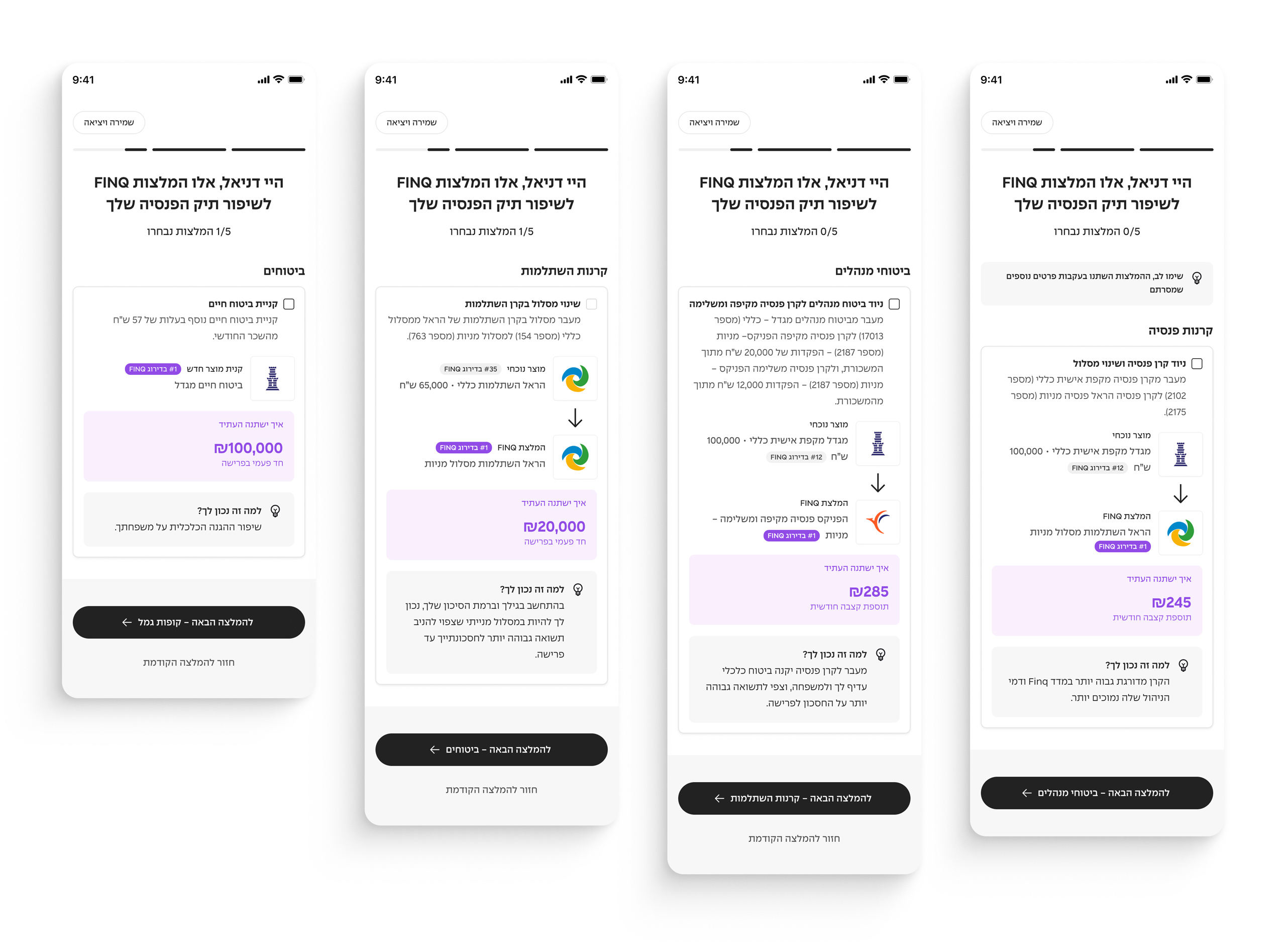
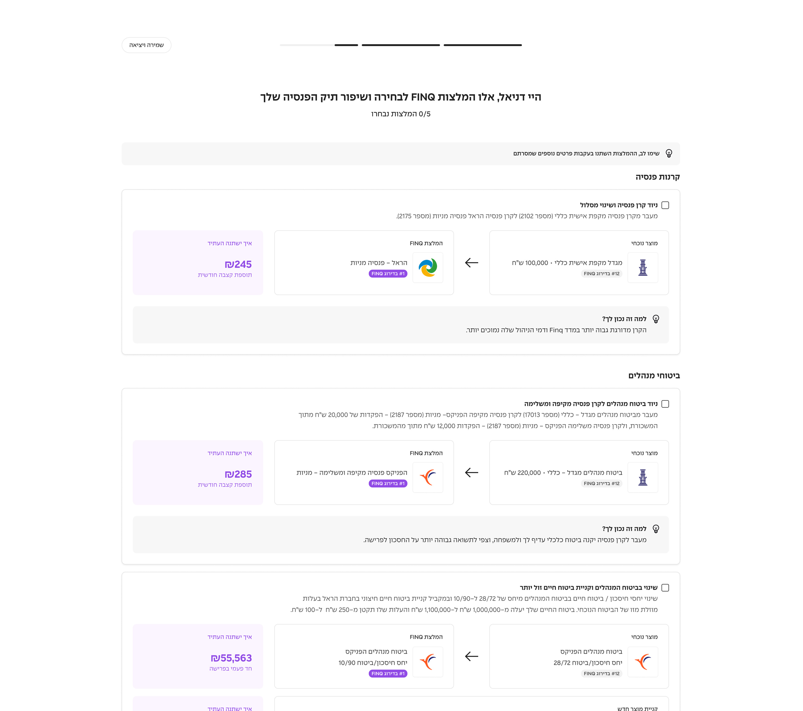
Users typically arrive with multiple financial products — pension funds, insurance policies, savings — each with its own recommendation. Presenting them as a flat list would have been overwhelming. Grouping them by product type created a clear hierarchy, letting users tackle one category at a time and reducing the cognitive load of the full picture.
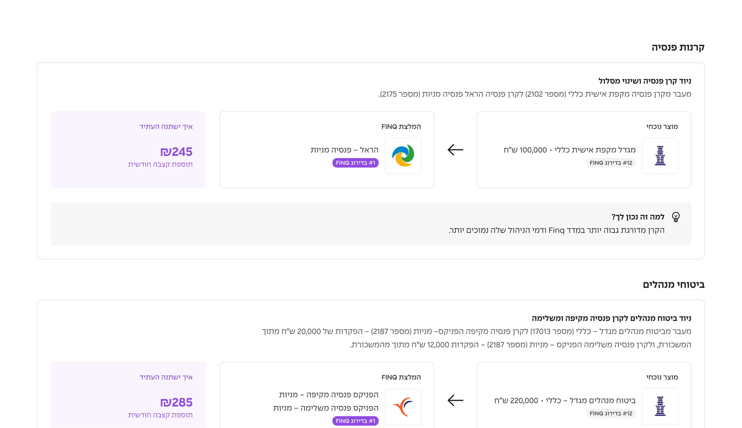
Current vs. recommended, side by side.
The recommendation page puts what you have now and what FINQ suggests in direct comparison. Users can see the delta — not just the recommendation, but what they’d be leaving behind and what they’d gain. Understanding what you’re moving away from matters as much as understanding where you’re going.

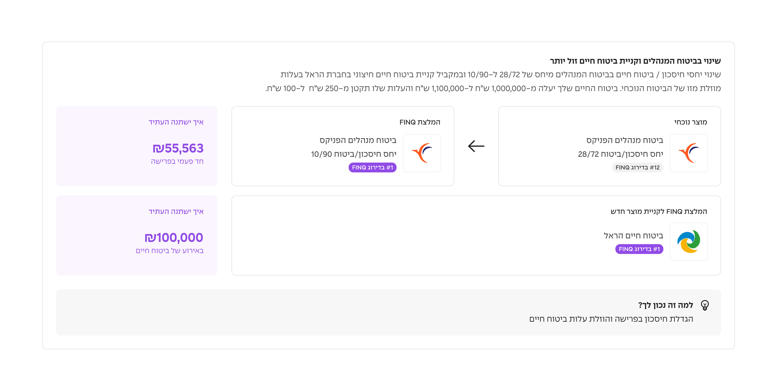
A concrete projection as the hook — but not a misleading one.
Showing a real number gives users something tangible, but a single total sum would have been dishonest: “how much you’ll save overall” depends on life expectancy, which no one can predict. The solution was to show the impact per product individually rather than rolling everything up into one impressive headline figure. Each recommendation carries its own projection — what this specific fund or policy change means for your monthly income at retirement — keeping it honest and actionable without oversimplifying.
“Why it’s right for you.”
Each recommendation surfaces a personalised rationale. Without an advisor to ask, users needed a reason to trust the suggestion. This signal was the trust layer — not generic marketing copy, but a specific explanation tied to the user’s own situation.
Splitting products into separate screens on mobile.
On desktop, all product recommendations can live on one scrollable page with enough room to breathe. On mobile, that same layout becomes an exhausting scroll — too much to process before you’ve even acted on anything. The solution was to break the recommendations into individual screens on mobile, one product at a time, keeping focus tight and the decision manageable.
Onboarding
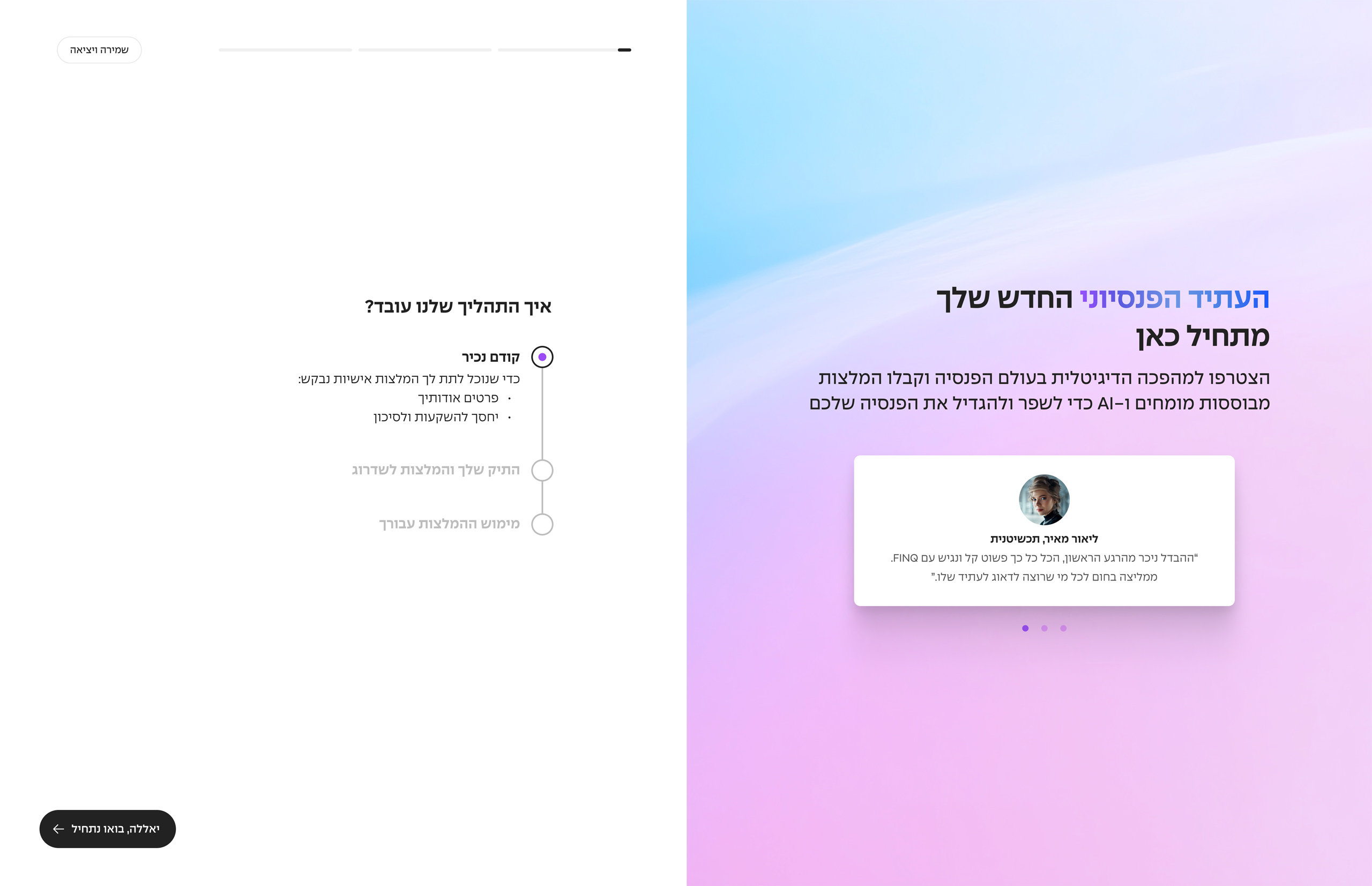
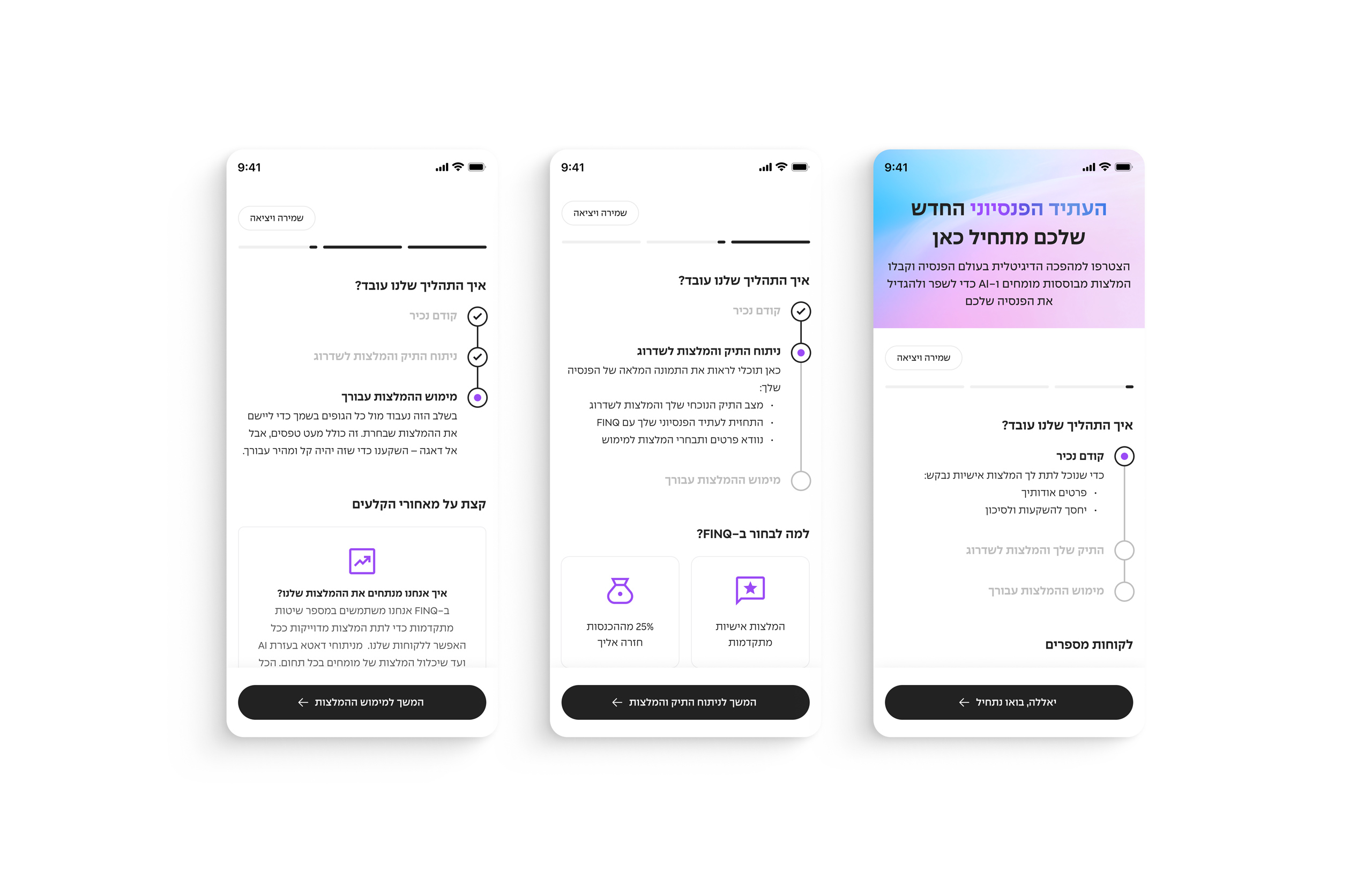
Onboarding that sets expectations.
The process of connecting your financial history is long. The onboarding was designed to frame the journey clearly — what you’re about to do, why it matters, and what comes next — so users don’t drop off before they’ve even started.
The homepage
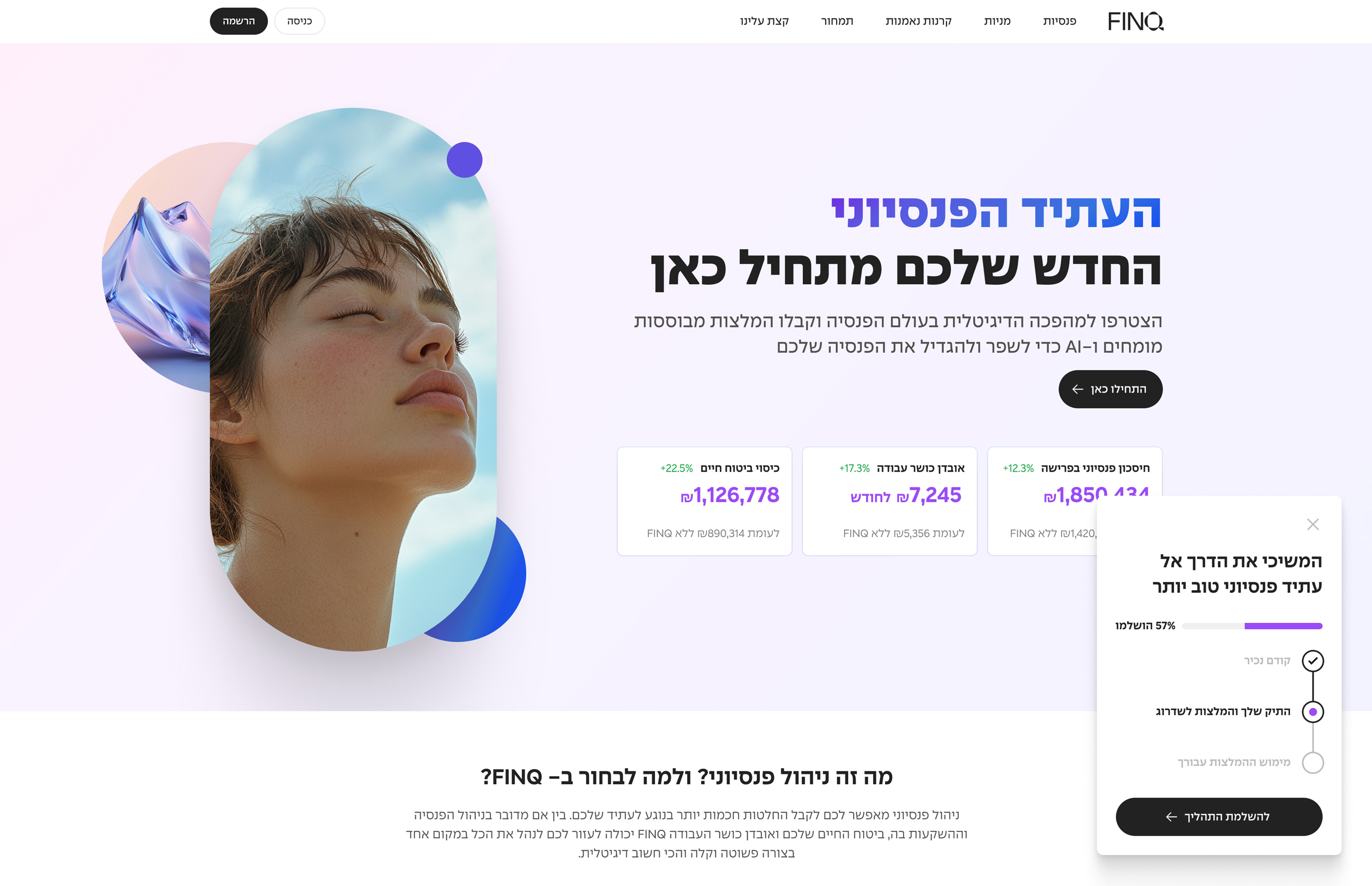
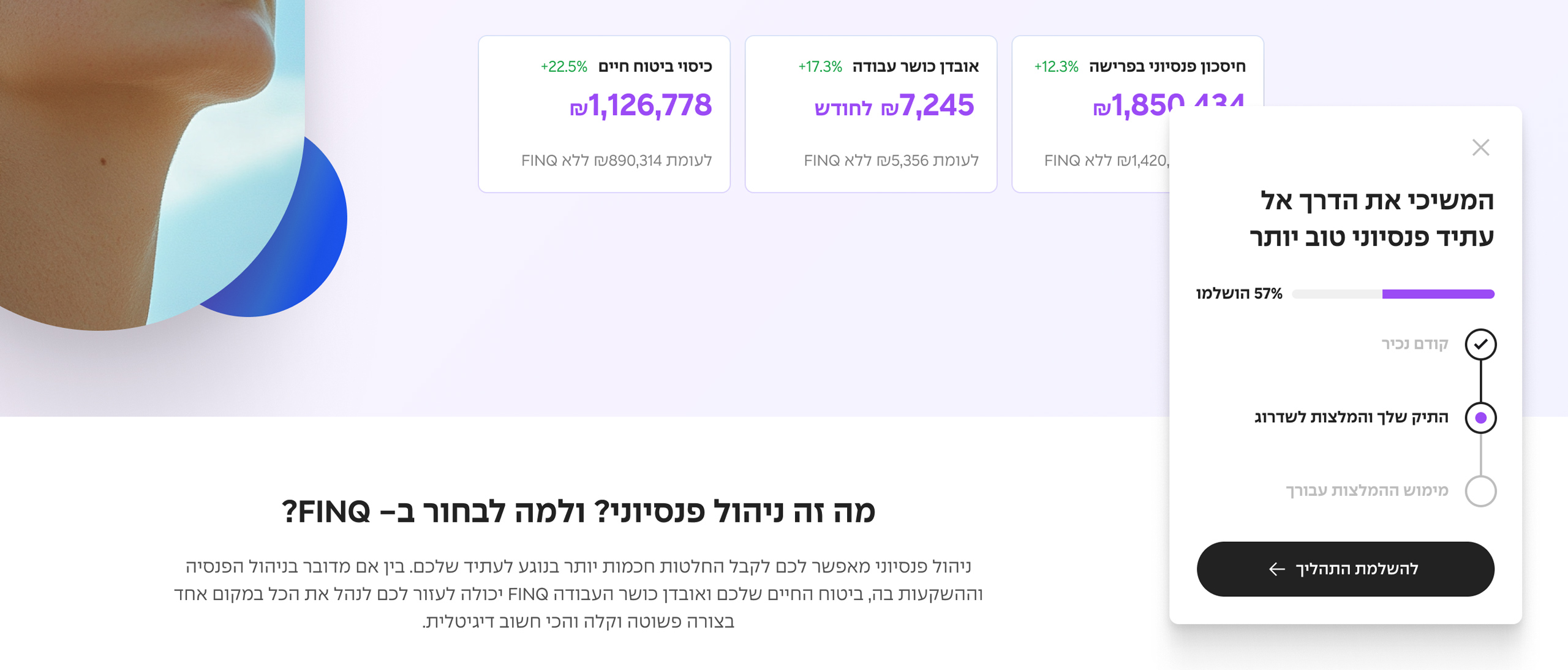
A progress-aware homepage.
The homepage is built to pull returning users back into an incomplete flow. A persistent component surfaces where they left off — “You’re 57% through” — making it easy to continue rather than feel like they’re starting over.
Outcome
The designs were completed and handed off within the project scope. The recommendation interface went from a complex, information-heavy spec to something legible enough to walk through without explanation — which was the brief.
FINQ was still at an early, proof-of-concept stage during this work, so success was measured by whether the structure was right for launch, not by post-launch metrics. What I can point to is the shift itself: a dense, advisor-dependent set of decisions turned into an interface a first-time user could read and act on alone.
What I’d Do Differently
The decision I’d most want to validate with data is the “why it’s right for you” rationale on each recommendation. The logic was clear — in a category where trust is the barrier to action, a personalised reason to believe a recommendation would move users further than a number alone. But without post-launch visibility into whether users who read the rationale converted at a higher rate, I can’t say whether we found the right signal or just the most plausible-sounding one. That’s a real gap: a trust mechanism you can’t validate is harder to defend the next time the question comes up.
The lesson isn’t to skip the rationale — it’s to instrument it. A simple A/B test against a version without it, or even qualitative sessions asking users what made them feel confident enough to act, would have grounded the decision in evidence. In high-stakes financial products, the moments that move trust are worth studying as carefully as the flows that move conversion.