Overview & Context
Falcon is an AdTech company with a specific focus: the thank-you page. After a purchase, instead of a dead-end confirmation, Falcon surfaces a personalized, brand-aligned offer — usually a free trial or perk with a major partner brand, matched to each customer with machine learning so it feels relevant rather than generic. For merchants, it’s incremental revenue per transaction with no implementation cost and a Shopify integration that goes live in minutes. The gift is the hook; the confirmation page is the placement.
My work spanned two areas: designing Falcon’s logo and identity, and the product design for how these gift moments get integrated and presented across partner contexts.
Brand Builders
The core project was Brand Builders — the system that lets partners configure and deliver gift offers through their confirmation pages. The challenge was deceptively specific: the placement is always the same (post-purchase), but the context varies enormously. Someone subscribing to a streaming service is in a different mindset than someone who just bought trainers, and the “earned it” trigger differs depending on whether the perk follows a purchase or a subscription. The work was finding treatments and framings that made each offer feel like a reward rather than an ad, tested across partner checkout and subscription flows.
Lightricks — Perks Hub & Mobile Moments
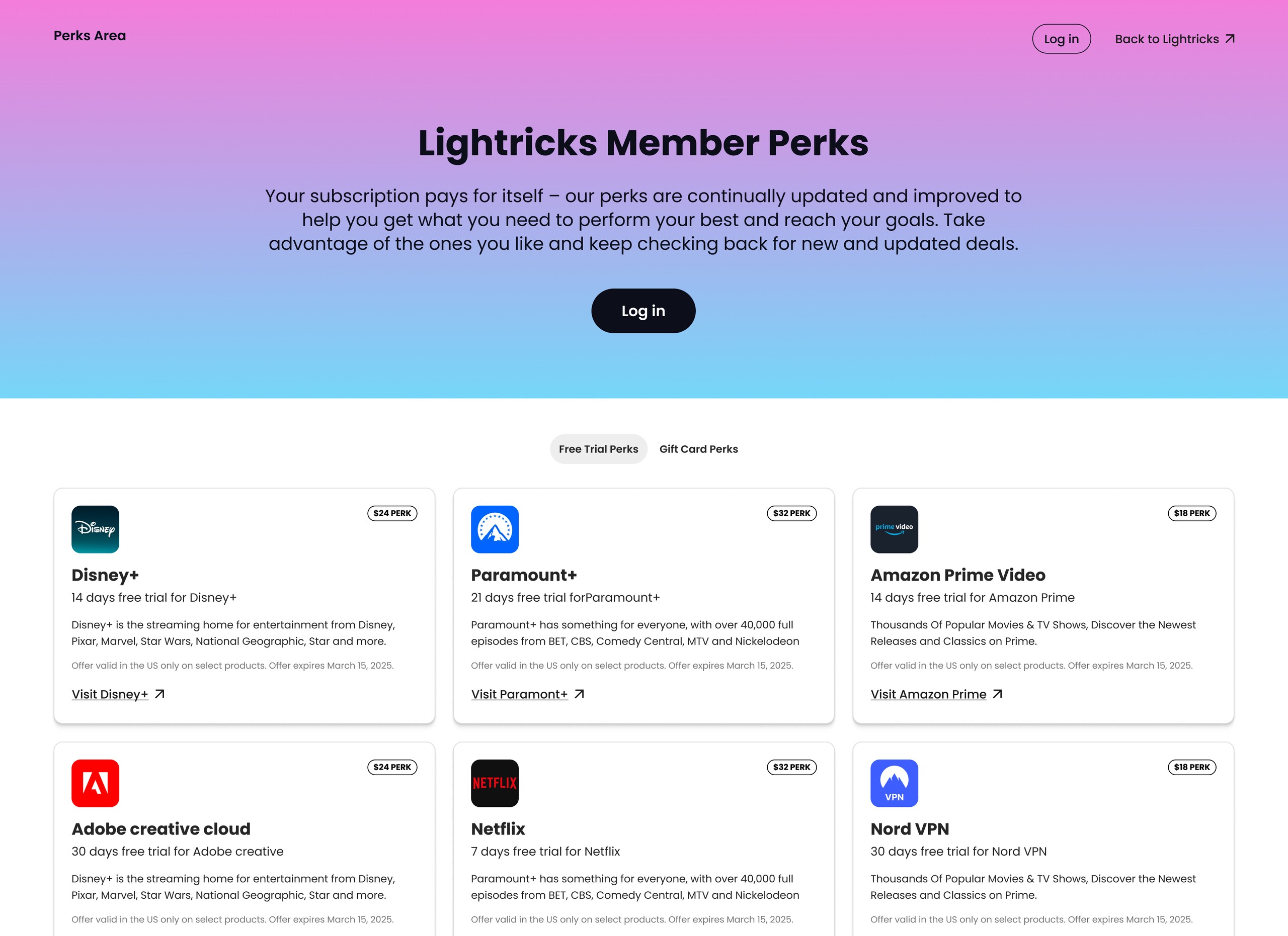
One of the more complete integrations was with Lightricks, the company behind Facetune. Subscribers get a dedicated perks hub — a place to browse and claim offers from partners like Disney+, Paramount+, Amazon Prime Video, Adobe, and Nord VPN. The desktop challenge was making a catalogue of disparate offers feel cohesive and worth exploring, not like an affiliate page.
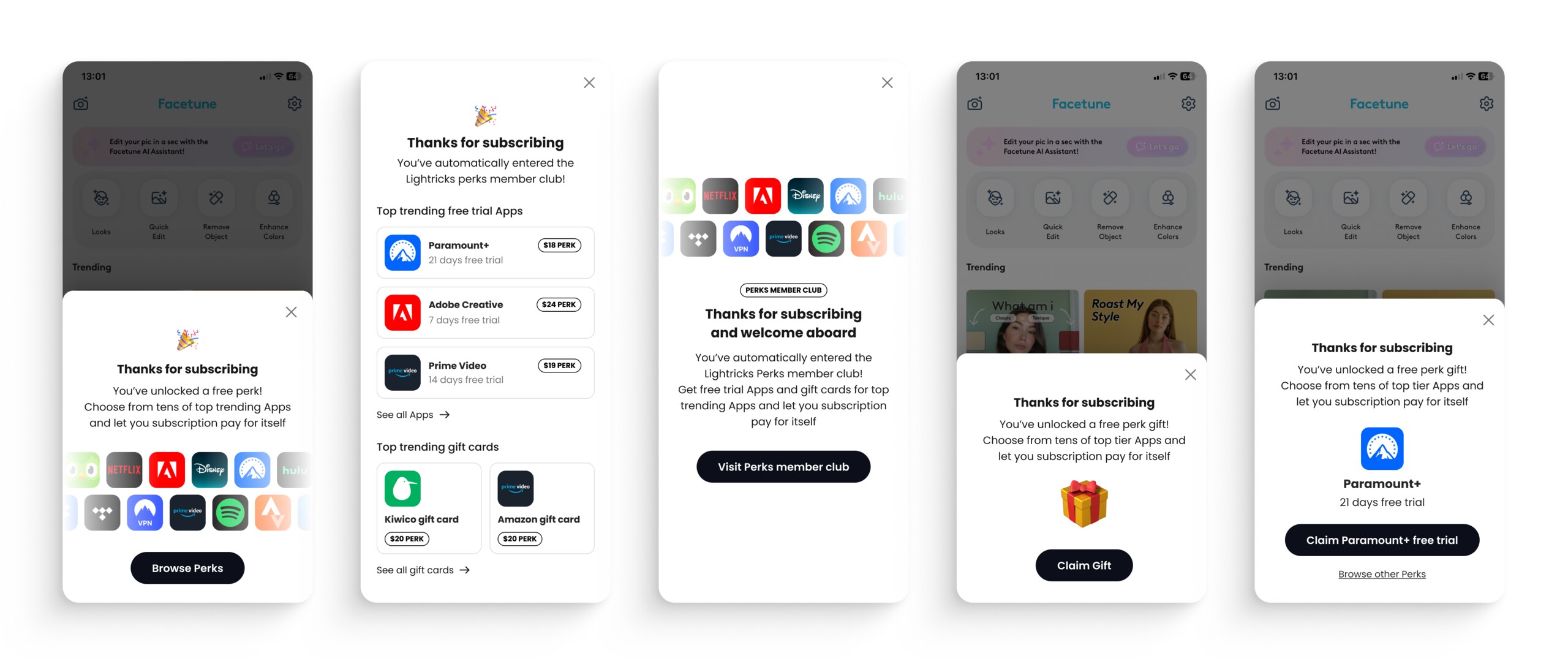
The harder problem was earlier: how to tell someone they’ve just unlocked perks the moment they subscribe, and get them to engage. I explored several approaches — a minimal prompt with a partner-logo grid, a curated list of trending offers, a single highlighted perk with a direct claim button — each a different bet on driving users from the subscription confirmation into the hub, shown here on mobile.
Zoog — Bundle Subscription Approaches
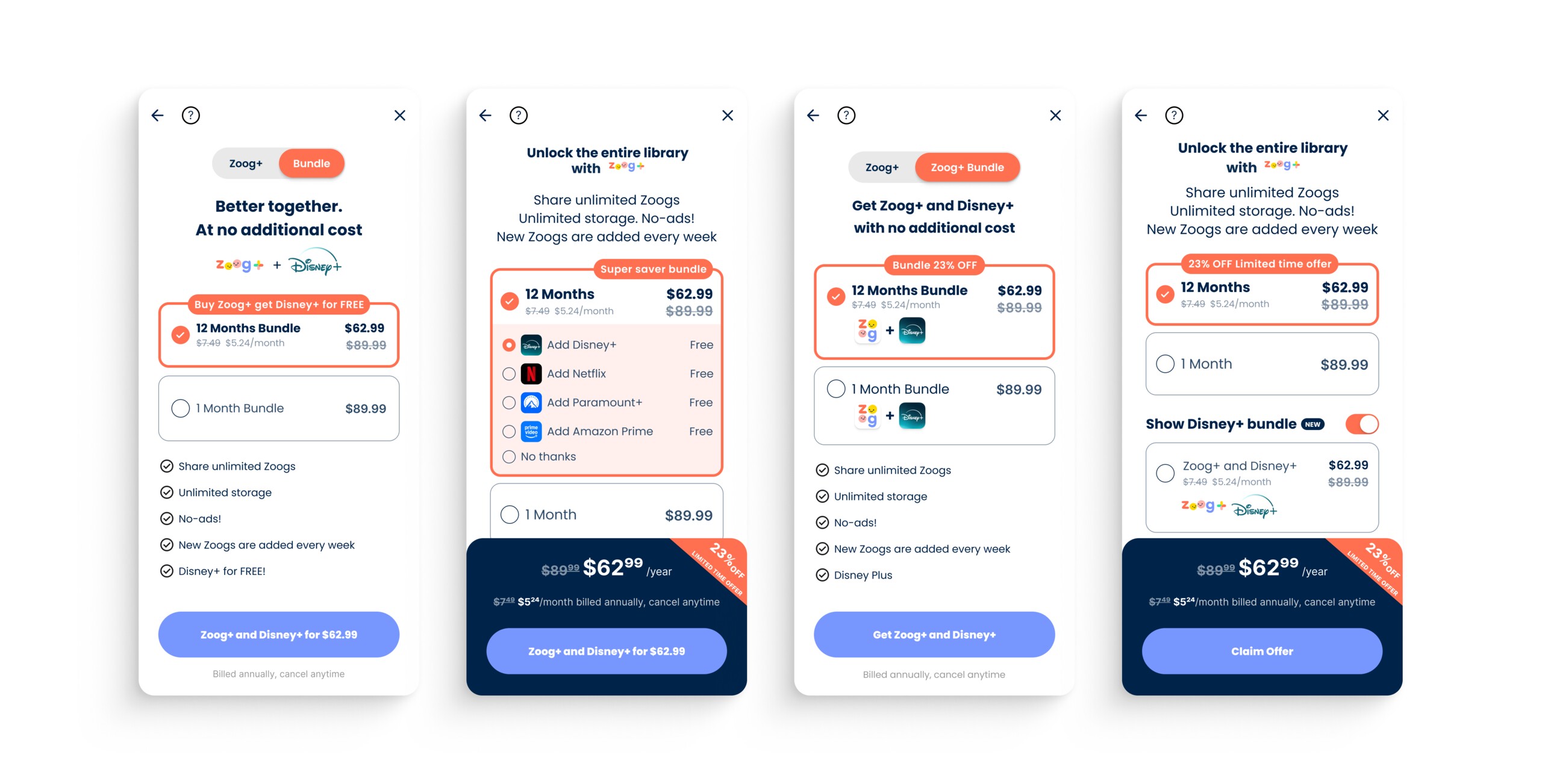
Zoog, a children’s streaming platform, was a different problem: rather than surfacing a third-party gift, the goal was nudging subscribers toward the annual plan (bundled with Disney+) over monthly, using the perk as the conversion lever.
The through-line was the power of default — in every variant the 12-month bundle was pre-selected; the question was which UI pattern made that feel most natural. I explored four: a tab switch into a preselected annual bundle with Disney+ shown free; a radio sub-selection letting users pick their free add-on; a two-option radio making the annual tier visually dominant; and a default-on toggle that reveals the bundle pricing beneath.
Underoutfit — Reusable Popover Component
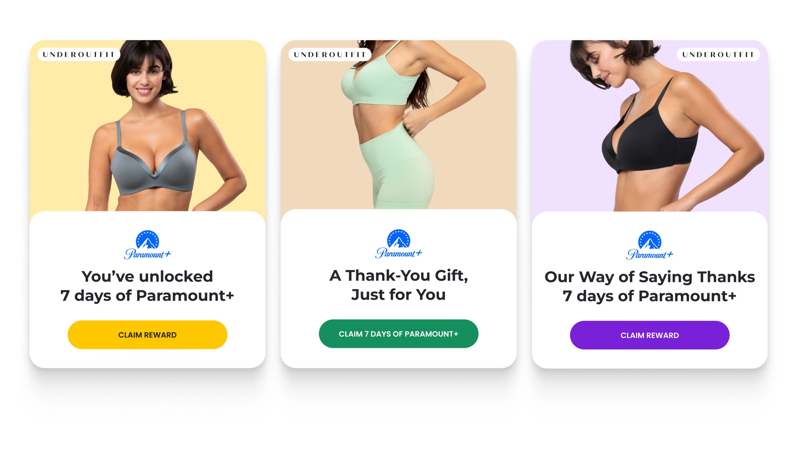
Working with the apparel brand Underoutfit moved the work toward something systematic. Instead of another one-off integration, we designed a reusable popover any partner could configure with their own colours and imagery. The anatomy is fixed — brand photo with partner logo, the offer logo, a two-line headline, a CTA — while the button colour and image tone are the variables. Three directions were explored on Underoutfit’s own imagery (purple, yellow, green), each a different mood over identical structure. A step toward gift moments that felt on-brand for each partner without a custom design every time.
Outcome
The engagement ran across 2024 and 2025, covering multiple partner integrations and a range of brand and placement configurations. The core challenge throughout was consistent: making a gift feel genuinely valuable at the moment a user is most open to receiving it.
What I’d Do Differently
This kind of work — designing for integration across many different partners, each with their own flows and constraints — makes it hard to hold a consistent standard. Each integration had its own context, and we were often adapting rather than defining. In hindsight, I’d have pushed earlier for a tighter component system for the gift moment itself: a set of building blocks that could flex across contexts without requiring each partner integration to be solved from scratch. The adaptation gets much faster when there’s something solid to adapt from.