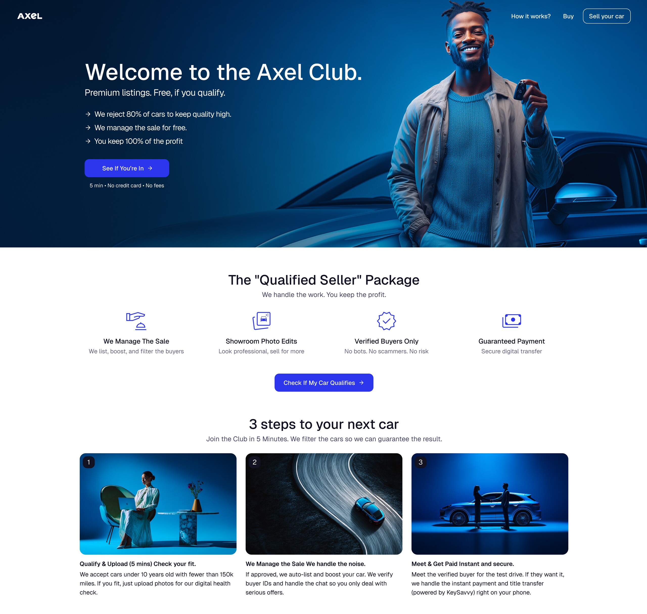
Overview & Context
Selling a used car in the US is a painful experience. You post on Facebook Marketplace, Craigslist, a few other places — and within hours your inbox fills up with lowball offers, flaky buyers, and agents trying to cut themselves into the deal. For buyers, there’s the opposite anxiety: can I actually trust what I’m looking at?
Axel’s answer is to take the whole process off the seller’s plate. You upload your car — photos, registration, details — and Axel handles everything else: syndicating the listing, fielding inquiries, screening buyers. When a serious buyer is found, seller and buyer meet once, and a third party manages the money and title transfer. No negotiating with strangers, no wasted weekends.
My scope was the seller listing flow and contributing to the design system being built alongside it.

The Problem
The listing flow was the entry point — the moment a seller commits to the platform. It had to do two things at once: collect a significant amount of information (photos at specific angles, pricing, registration, vehicle history) while keeping the seller motivated through a process that was inherently long.
The core tension: if sellers don’t complete the flow, Axel has nothing to work with. But if the flow feels like a burden, they abandon it. Every step needed to justify itself.
The flow was also designed mobile-first — most sellers would be on their phones, and they’d need one for the photos anyway.
Research
Before any design work started, a UX researcher led a round of discovery interviews with potential sellers — exploring their frustrations with existing platforms, what they wished the experience would handle for them, and what concerns they’d have about trusting a new service with the sale. The PM and I were part of those conversations. The interviews shaped the core assumptions behind the listing flow: that sellers’ biggest fears were wasted time and untrustworthy buyers, and that the platform’s value needed to be earned progressively rather than promised upfront.
Key Decisions
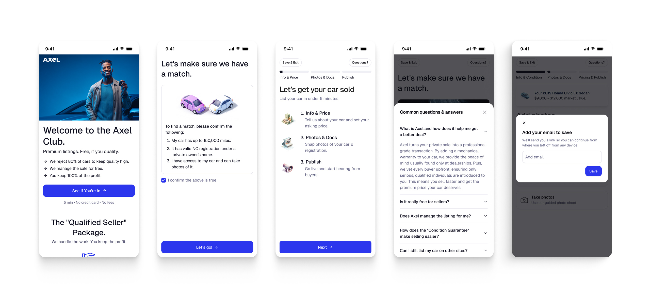
Setting expectations upfront
Qualifying sellers at the start.
Not every car — or every seller — is the right fit for Axel. Rather than let people discover this halfway through a long form, the flow surfaces the qualification criteria right at the beginning. Sellers who don’t qualify exit early, before investing time. Sellers who do qualify enter with a clear sense of what they’re signing up for.
FAQ access throughout.
A persistent FAQ entry point in the top-right gives sellers a way to answer their own questions without derailing the flow. In a process with this many steps, ambient reassurance matters.
Getting through the hard part
A progress stepper for the whole flow.
The flow is divided into three named phases — Info & Price, Photos & Docs, Publish — visible as a persistent stepper at the top of every screen. Sellers always know where they are and how much is left. In a flow this long, macro orientation matters as much as step-level clarity.
Save & Exit on every screen.
Every screen has a Save & Exit option. Given that the core tension was abandonment risk, the direct answer was to make leaving non-destructive: sellers can drop out at any point and return exactly where they left off. This also reduces the pressure of committing to a long session upfront.
Because the flow doesn’t require sign-up at the start, there’s no account to save progress to — so Save & Exit prompts for an email address, giving sellers a way to resume on any device. Progress is also written to local storage as a fallback: return to the flow on the same device without clearing your cache, and it picks up where it left off.
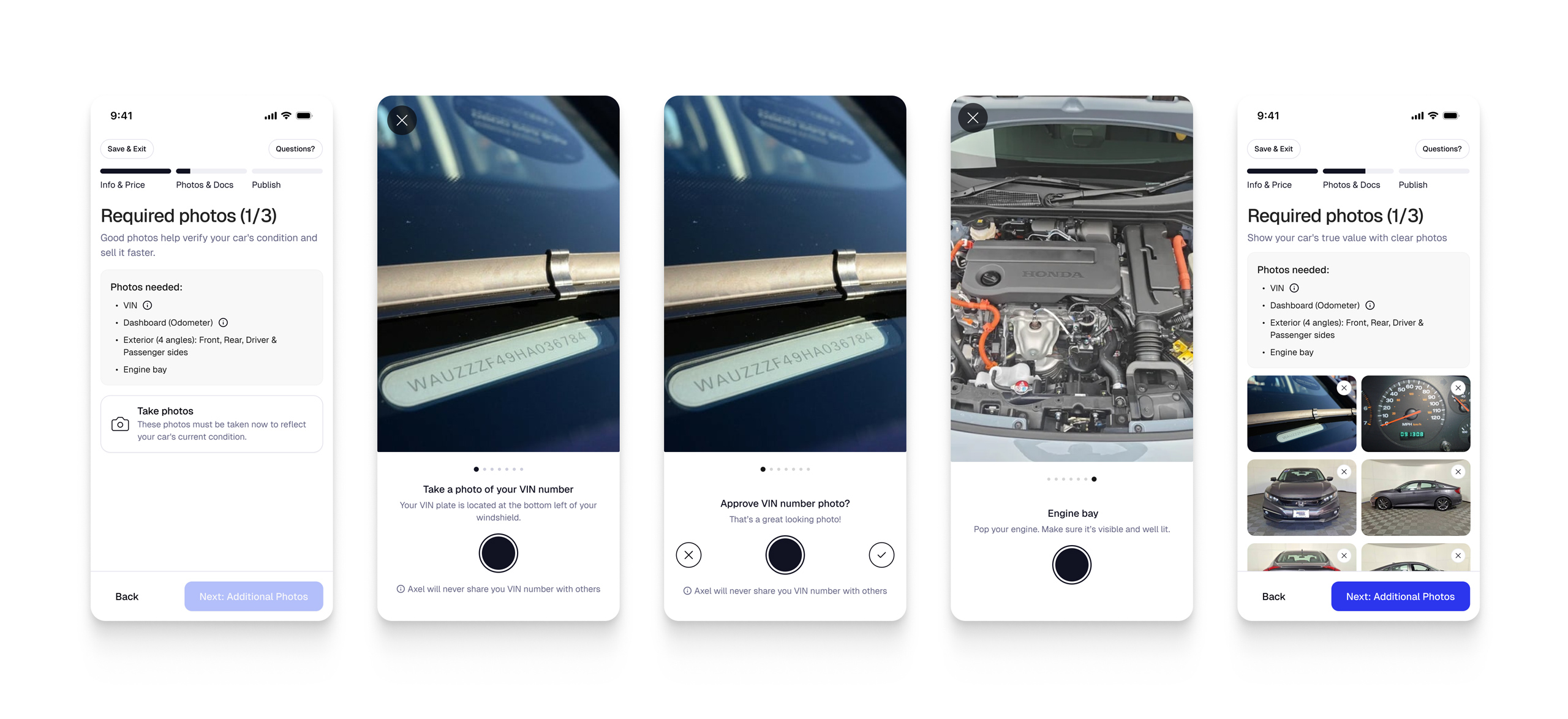
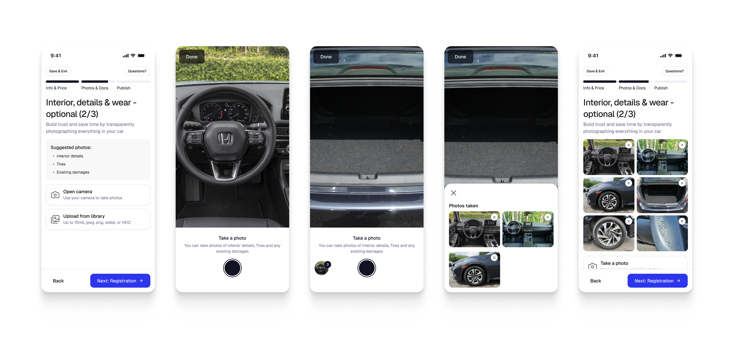
Structured photo guidance.
Photos are one of the biggest drop-off points in any listing flow. Axel requires a defined set of shots — VIN, dashboard, exterior angles, engine bay — enough to verify condition and build buyer trust, but nothing beyond what’s actually necessary. Rather than presenting a blank upload screen, the flow walks sellers through each shot one at a time, with contextual instructions (where to find the VIN plate, how to frame the engine bay) and an approval step after each photo before moving on.
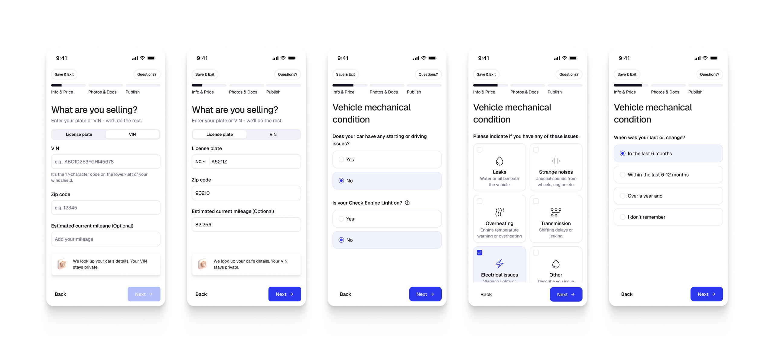
Inline tips along the way.
Rather than front-loading instructions, contextual tips appear at the relevant step. A tip about pricing lands next to the pricing input; a tip about photo quality appears during the photo step. This keeps the flow from feeling like a lecture while still giving sellers what they need to succeed.
Giving something back
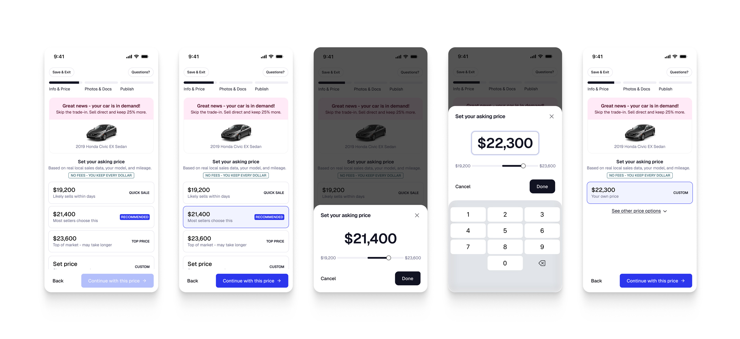
Three-tier price presentation.
After completing the first section, sellers receive a market-based price recommendation — but not just a single number. The screen shows three anchored options: trade-in value, the price most sellers choose (highlighted as recommended), and the top of the market. Presenting the range gives sellers agency while the recommendation reduces decision paralysis. It also makes the output feel like advice rather than just data.
Closing the loop after submission.
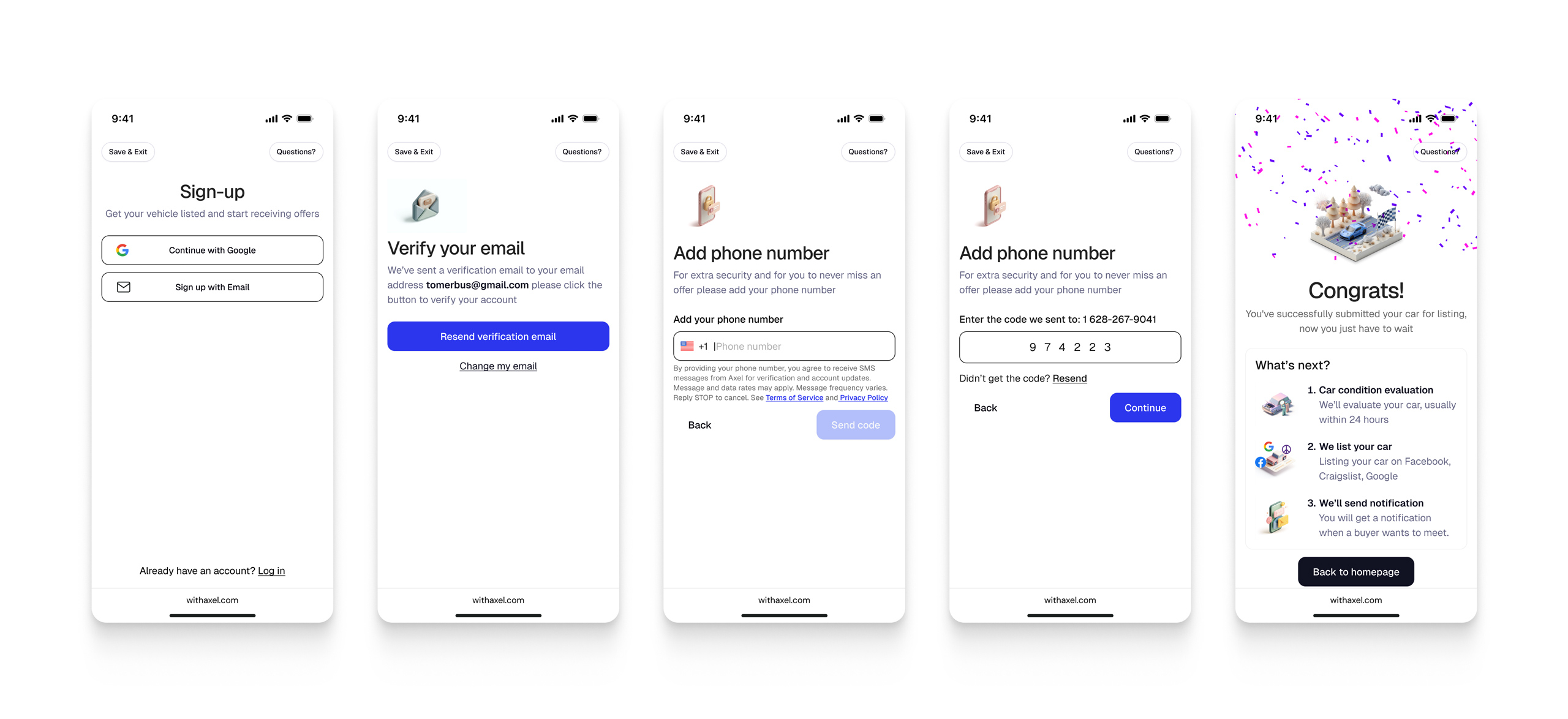
The final screen isn’t just a confirmation — it’s a “What’s next?” handoff that tells sellers exactly what Axel will do: evaluate the car’s condition, syndicate the listing, and notify them when a buyer is ready to meet. This matters because a long form that ends abruptly feels like submitting into a void. The handoff screen closes the loop and earns the seller’s patience for what comes after.
Outcome
The listing flow was designed and handed off as part of a broader engagement that also included establishing the design system used across the product. Before handoff, we ran usability testing on a working version of the flow — no significant issues surfaced, and sellers moved through the steps without notable confusion or drop-off. The product was still at proof-of-concept stage, so the work was about getting the structure right for launch: making a high-friction onboarding feel purposeful rather than exhausting.
What I’d Do Differently
The decision I’d most want to revisit with data is the upfront qualification gate. The rationale was sound — surface the criteria early so sellers who don’t fit exit before investing time in a long flow, and sellers who do fit enter with clear expectations. But that logic assumes the gate is well-calibrated. Without conversion data from that step, I can’t say whether it was filtering out sellers who genuinely weren’t a good fit, or filtering out sellers who would have converted if they’d gotten a bit further and understood the value.
Early qualification gates are a real product decision, not just a UX courtesy. They deserve the same testing attention as the steps that come after — specifically, tracking what happens to the people who exit at the gate. If even a fraction of them would have been good sellers, the gate is costing the platform more than it saves.